Why we gave a cron job monitor a personality.
Cron job monitoring. Doesn’t that sound exciting? Sexy? Confusing? Probably the latter. Could be the former if you are into that kind of thing. A cron job is a time-based job scheduler that is used to schedule jobs (commands or shell scripts) to run periodically at fixed times, dates, or intervals. Dead Man’s Snitch (DMS) is a cron job monitoring app by Collective Idea aimed at making monitoring cron jobs suck less.
Our team has worked hard to make it the simplest and most enjoyable tool of it’s kind. Until recently, it suffered from something that a lot of small apps and web based tools experience. It was great but it lacked a voice to help differentiate it and allow others to understand how great it is.
The appearance of the app has always been clean, simple, and a lot like other apps that exist today. At a glance it didn’t stand above it’s competition or demand attention. It didn’t help that there was no “Why?” for Dead Man’s Snitch. It did things that a lot of developers could benefit from using. Unfortunately, it looked and sounded like a lot of things that already exist. Convincing people to pay for such a service has been a challenge. When I joined Collective Idea, Daniel and I talked about doing something about that.
We started with storytelling.
When we started talking about what we could do to increase uptake of the tool, there was a big disconnect between the name and the product. The name lends itself to a deeper story. We wanted to breath that life into it and help our potential customers understand what we were offering.
Dead Man’s Snitch is a riff on dead man’s switch. A dead man’s switch is triggered when someone or something dies and causes something to happen (usually a building blowing up in movies). In our case, the thing dying is a process. The title is rich with retro-noir ideas and visuals and has really deep storytelling roots. Dead men tell no tales, snitches, crime, espionage, all those dark corners (of your workflow)… We can do all sorts of amazing things with a brand based on this kind of material.
When we began reimagining DMS, we started with sketching, doodling, silly conversations, anything that got our collective minds moving in this direction. Initially the ideas were pretty far out and we naturally pushed and pulled them until we landed in an area that we all loved. We chose to move forward with a subtle nod to noir storytelling while keeping the product classy and refined.
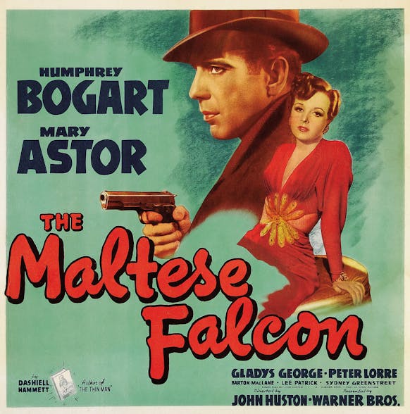
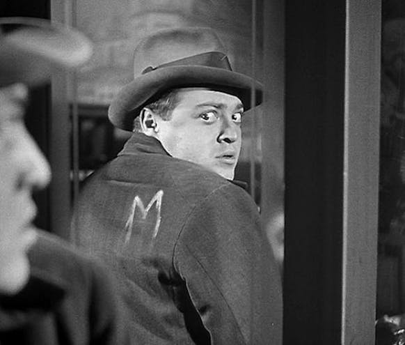
Some inspiration was drawn from film.
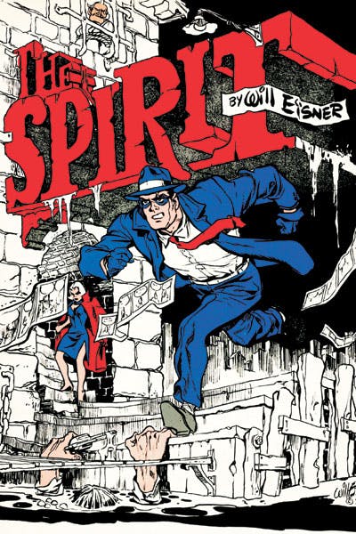
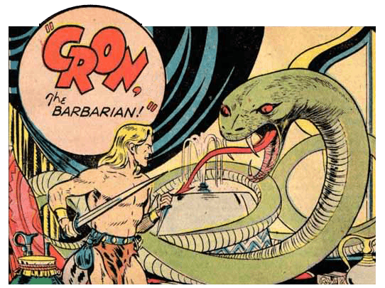
Classic comics also were an inspiration.
We needed a character.
The icon for Dead Man’s Snitch used to be one of the status LED’s that we use within the app. We knew that we would be better off if there was an actual logo that people could recognize. To keep with our noir theme we chose a classic, the private detective. Someone lurking in the shadows and monitoring your crons. The influences for our character are pretty obvious, classic movies like The Maltese Falcon, M, etc. Another influence was comics like The Spirit and The Question. All of these stories featured a cloaked detective wearing a fedora.
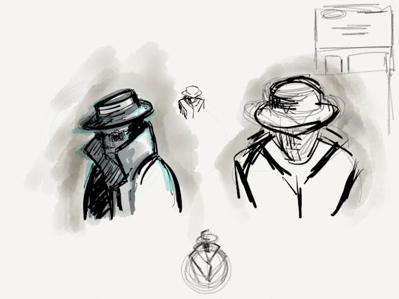
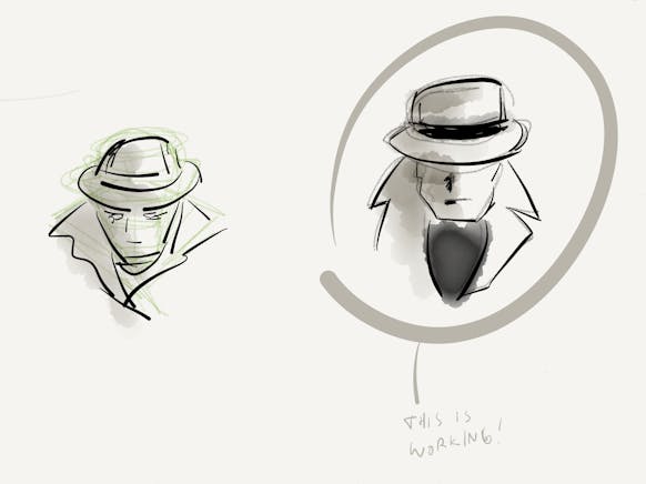
These are some of the concept sketches that I did for the logo.

The new Dead Man’s Snitch logo with type.
![]()
The new app icon.
Implementing iteratively.
Our approach for rolling out the new voice and style of Dead Man’s Snitch is an iterative one. Rather than wait for every last piece of the app to be completely overhauled, we have incrementally made pieces better frequently. This allows us to think on our toes and evolve the brand as we learn from our customers and ourselves. It is also more cost effective. In software, especially internal projects, it is not feasible to stop everything and completely overhaul something that already works and has customers.
The first part of the project to see an update was actually the newest. The DMS app for iPhone was the safest and easiest point of entry for us to experiment with look and feel. Before the logo or character were a complete thought, we tinkered and experimented with how it would play out in the app. The iPhone app features the ability to see if your snitches are running from your phone, but more importantly it will tell you if they have stopped running through push notifications. This is something that doesn’t happen if you are just using the web app.
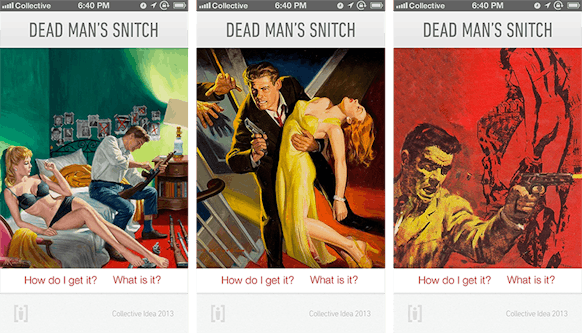
These are concepts for the app splash screen that didn’t make it into the final version.
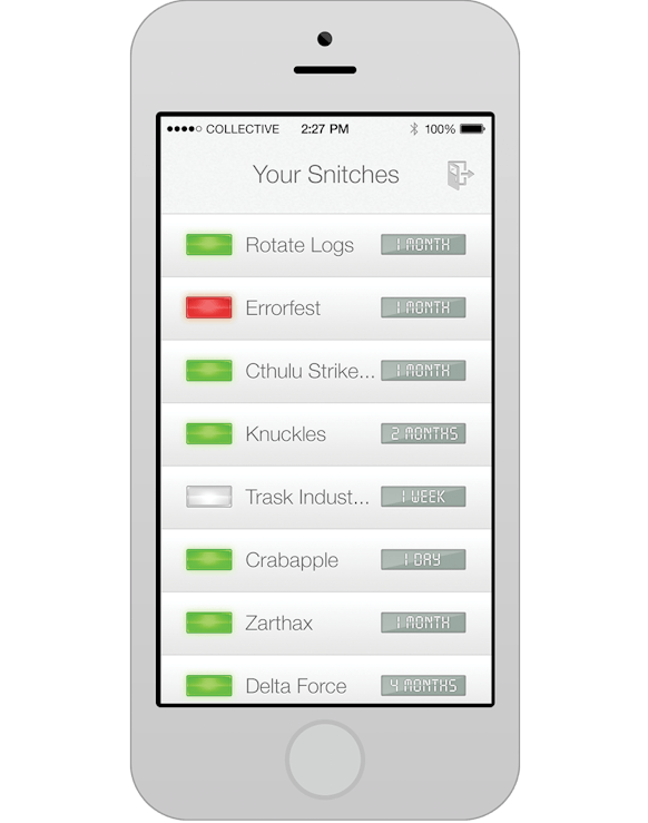
The final launched version of the app.
After we launched the app, we turned our attention to the promotional website for DMS. We boosted the amount of information about the app and made everything bigger, bolder, and more readable. More importantly, the site was mobile friendly so that people could not only read about DMS but sign-up and start using our service as well.
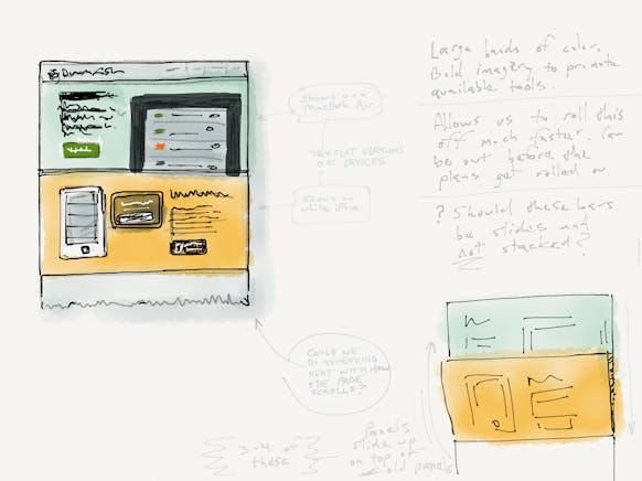
Concepts for the public website.

The final public website.
We have many more enhancements and upgrades planned. Many are already underway and may be showing up soon.
Why be boring?
It sucks when things are boring. If you have the opportunity to breath life into your work and make it relatable, why wouldn’t you? Dead Man’s Snitch provided an opportunity for use to breathe life into our application and make it fun and interesting. A great side effect is something that is easier to sell and helps potential customers understand why they should use it more effectively. Those are pretty awesome side-effects for doing the right thing.
You can learn more about Dead Man’s Snitch at deadmanssnitch.com.

Comments