Fun with SVG: CSS background-blend-mode Fallback
https://pixabay.com/static/uploads/photo/2015/08/15/12/16/cat-889473_960_720.jpg
In our current website, we wanted to use background images with color overlays (See Figure 1) in a few places. Living, as we do, in The Future™ I glommed on to the shiny new background-blend-mode CSS property. Sadly, this is not supported in any version of Internet Explorer (including Microsoft Edge). While this makes me sad, it does present an opportunity to play around with SVG.

| IE 9 | IE 10 | IE 11 | Edge | Firefox | Chrome | Safari 8 | Safari 9 | |
|---|---|---|---|---|---|---|---|---|
| background-blend-mode | No | No | No | No | Yes | Yes | Yes | Yes |
| Inline SVG | Yes | Yes | Yes | Yes | Yes | Yes | Yes | Yes |
| SVG Filters | No | Yes | Yes | Yes | Yes | Yes | Yes | Yes |
Before we get too far ahead of ourselves, we’re going to need to use some javascript for feature detection. Since we can’t trust javascript to be available, give your <html> element a class of “no-js”, and add the following to the beginning of your page’s <head>:
<script>
  (function (H) {
    H.className = H.className.replace(/(\s|^)no-js(\s|$)/,"$1js$2")
  })(document.documentElement);
</script>
And make sure you have a nice, high contrast background color set on your blended background for non-javascript users. Something like:
.no-js .blended-background { color: #fff; background-color: #369; }Now, moving on to our ideal case, we have a square div with a colored background, and a background image prepared for several screen sizes.
<style>
.square {
width: 50%;
height: 0;
padding: 0 0 50%;
text-align: center;
}
.square h1 {
position: absolute;
top: 50%;
right: 10%;
left: 10%;
margin-top: -.7em;
line-height: 1.4;
text-align: center;
}
.blended-background {
position: relative;
color: #fff;
background-color: #369;
background-size: cover;
background-position: center;
background-blend-mode: multiply;
background-image: url(//placekitten.com/1500/1500);
}
@media screen and (max-width: 250px) {
.blended-background { background-image: url(//placekitten.com/250/250); }
}
@media screen and (max-width: 500px) {
.blended-background { background-image: url(//placekitten.com/500/500); }
}
@media screen and (max-width: 1000px) {
.blended-background { background-image: url(//placekitten.com/1000/1000); }
}
</style>
<div class="square blended-background">
<h1>I have a background!</h1>
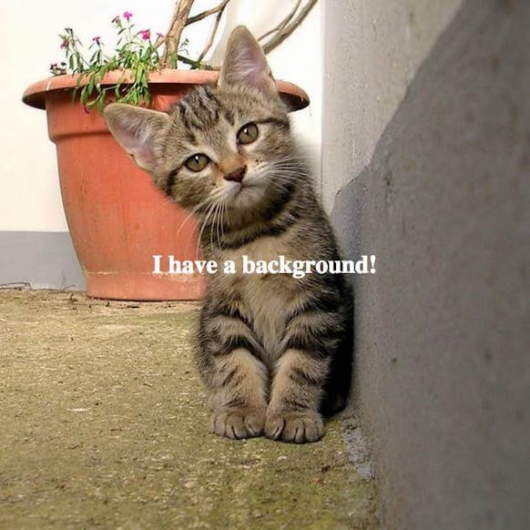
</div>This looks great, on supported browsers. On Internet Explorer 9–12(+?) it shows a full color kitten, behind some white text. Readability suffers. (See Figure 2)
So, we need to find out if background-blend-mode is supported, and add some useful classes to the <body> that we can style off of.
<style>
  .square {
    width: 50%;
    height: 0;
    padding: 0 0 50%;
    text-align: center;
  }
    .square h1 {
      position: absolute;
      top: 50%;
      right: 10%;
      left: 10%;
      margin-top: -.7em;
      line-height: 1.4;
      text-align: center;
    }
  .blended-background {
    position: relative;
    color: #fff;
    background-color: #369;
    background-size: cover;
    background-position: center;
    background-blend-mode: multiply;
    background-image: url(//placekitten.com/1500/1500);
  }
  @media screen and (max-width: 250px) {
    .blended-background { background-image: url(//placekitten.com/250/250); }
  }
  @media screen and (max-width: 500px) {
    .blended-background { background-image: url(//placekitten.com/500/500); }
  }
  @media screen and (max-width: 1000px) {
    .blended-background { background-image: url(//placekitten.com/1000/1000); }
  }
</style>

<div class="square blended-background">
  <h1>I have a background!</h1>
</div>

<script>
  (function () {
    var will_it_blend = function () {
      var arca = document.createElement("div");
      if ("backgroundBlendMode" in window.getComputedStyle(arca)) {
        document.body.className += " cssBackgroundBlendMode";
      } else {
         document.body.className += " noCssBackgroundBlendMode";
      }
    };

    will_it_blend();
  }());
</script>
If you’re in your happy place, and you can ignore Internet Explorer, you could add a little CSS and be done.
.noCssBackgroundBlendMode .blended-background { background: #369; }You’re probably going to have to deal with IE though, so here’s the fun part.
Internet Explorer 9+ supports inline SVG. Internet Explorer 10+ supports SVG filters, including the multiply filter. Internet Explorer 8 treats inline SVG like a generic block element. So, we prepend a simple SVG to our div, position it absolutely, and color it blue with CSS (for Internet Explorer 8). Inside the SVG we include a filter, which IE 9 ignores, and blue rect element which IE9 renders.
Finally, we use javascript to figure out which background image is currently displaying based on @media, and stick it in the feImage's xlink:href attribute.
<style>
    .square {
      width: 50%;
      height: 0;
      padding: 0 0 50%;
      text-align: center;
    }
      .square h1 {
        position: absolute;
        top: 50%;
        right: 10%;
        left: 10%;
        margin-top: -.7em;
        line-height: 1.4;
        text-align: center;
      }
    .blended-background {
      position: relative;
      color: #fff;
      background-color: #369;
      background-size: cover;
      background-position: center;
      background-blend-mode: multiply;
      background-image: url(//placekitten.com/1500/1500);
    }
    @media screen and (max-width: 250px) {
      .blended-background { background-image: url(//placekitten.com/250/250); }
    }
    @media screen and (max-width: 500px) {
      .blended-background { background-image: url(//placekitten.com/500/500); }
    }
    @media screen and (max-width: 1000px) {
      .blended-background { background-image: url(//placekitten.com/1000/1000); }
    }
    .blended-background .cssBackgroundBlendFallback {
      position: absolute;
      top: 0;
      right: 0;
      left: 0;
      display: block;
      width: 100%;
      min-width: 100%;
      min-height: 100%;
      background-color: #369; }

    .cssBackgroundBlendMode .cssBackgroundBlendFallback {
      display: none; }
  </style>

  <div class="square blended-background">
    <svg xmlns="http://www.w3.org/2000/svg" xmlns:xlink="http://www.w3.org/1999/xlink" class="cssBackgroundBlendFallback">
      <defs>
        <filter id="myFilter">
          <feImage xlink:href="#" result="slide2" x="0" y="0" width="100%" preserveAspectRatio="xMidYMid slice" />
          <feBlend in2="SourceGraphic" in="slide2" mode="multiply" />
        </filter>
      </defs>
      <rect x="0" y="0" fill="#369" filter="url(#myFilter)" width="100%" height="100%" />
    </svg>

    <h1>I have a background!</h1>
  </div>

  <script>
    (function () {
      var fallback = document.querySelector('feImage[result="slide2"]'),
        blended_bg = document.querySelector('.blended-background'),
        quotes = /"/g,
        bg,
        will_it_blend = function () {
          var arca = document.createElement("div");
          if ("backgroundBlendMode" in window.getComputedStyle(arca)) {
            document.body.className += " cssBackgroundBlendMode";
          } else {
           document.body.className += " noCssBackgroundBlendMode";
          }
        };

      will_it_blend();

    if (fallback !== null && blended_bg !== null) {
    bg = getComputedStyle(blended_bg).backgroundImage;
    if (bg !== "none") {
      fallback.removeAttributeNS('http://www.w3.org/199/xlink', 'xlink:href');
      fallback.setAttributeNS('http://www.w3.org/1999/xlink', 'xlink:href', bg.replace(quotes, '').slice(4, -1));
    }
  }
}());
</script>
Now you’ve got a fancy blended image, and your content producers/editors/whoever can swap it out for any background image they desire, and the treatment still gets applied. You can of course change the color to be anything you want, and you could even use some different blend modes.
If you wanted to get real crazy you could set up the javascript to do multiple blended elements on a single page, change the blend mode on hover, or blend an animated GIF (performance will suffer, but it would be cool).
View an example of the finished product on Codepen. Play around a bit, see what you can do.
About Matt Slack
Long a secret weapon at Collective Idea, Matt has been involved with Collective Idea projects since the beginning. He’s our resident web front-end master (webmaster?) who can knock out CSS and HTML faster than you can think.
Comments
Wow, that’s all over the Internet, the only tutorial that has an example so that “blend mode” looks good in all browsers. Unfortunately, I can not do it on my website to implement. Do you have me a tip? Rene
hey, very cool!
I tweeked your code a little on codepen, so it dosen’t need Js (but also dosen’t use responsive bg images)
just in case someone is interested: https://codepen.io/cojaco/pen/WKRbRJ
Nico,
So, I went to your codepen in IE11 and Edge, but it doesn’t work. According to CodePen, IE11 isn’t supported. So I’m not sure your tweek works in all browsers.